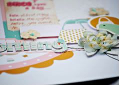
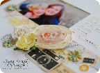
Playing with some Nikki Sivils last week for Nikki's blog, and I decided to mix things up and use 2 lines to design my layout. I used "school is cool" and "Get well soon"
It just shows that the name of a collection is not the only use you can have for it. I love the colours in the "Get Well Soon" collection, but I had already done a layout of a poorly Lilly and didnt want to do another "get well soon" themed layout.
Supplies : Nikki Sivils papers, die cuts, buttons, and alphabet stickers, Prima flowers and gems, wooden monogram from stash
The colours of both these collections worked well together. The photos are from a day on the river back in June.
Head on over to Nikki Sivils blog to see what the rest of the international DT did this month.
Thanks for stopping by
Anna x
Subscribe to:
Post Comments (Atom)


Beautiful layout!